This is the fifth article in a series of blogs on the traffic situation in Brussels in times of COVID-19 restrictions. It is inspired by a recent quote by virologist Steven Van Gucht on people getting around more often again, and the effect this would have on the number of COVID-19 infections.
Our previous analyses were based on a dataset of Brussels Mobility, which contains vehicle counts from 55 busy locations in the city of Brussels. During the first lockdown in March 2020, we discovered, as communicated in our first blog, that traffic had dramatically reduced overall, but less so on the small ring of Brussels, where peaks of up to 80% of retained traffic were observed. In the previous blog (the fourth), we investigated the traffic volume evolution in relation to historical values since 2018, in order to consider the seasonality and holiday effects impacting traffic volumes. We observed that the traffic volumes in October 2020 were very close to normal (pre-COVID-19) conditions.
Today’s blog is inspired by a quote by virologist Steven Van Gucht in Het Journaal on 9 December: "…wat wel opvalt is dat we ons vaker verplaatsen… en daarvan weten we dat dat een vrij goede voorspelling is van het toekomstig aantal nieuwe besmettingen." [... what is striking is that we are getting around more often... and we know that that is a pretty good prediction of the future number of new infections.] Since vehicle counts data is closely connected to people’s movements, it is worthwhile to investigate whether Steven Van Gucht’s statement is valid, i.e., how well traffic intensity correlates with, or even more, predicts peaks in COVID-19 infections.
The blog reveals three main insights:
- a certain threshold in traffic load needs to be exceeded in order to observe an effect on the number of COVID-19 related hospitalisations
- there is a clear difference in effect on traffic between residential areas and more business strategic locations
- peaks in COVID-19 hospitalisations follow peaks in traffic volumes with a very variable time offset depending on the time of the year
Less than 16 000 vehicles a day in Brussels controls the pandemic
As a first use case, we consider the average daily vehicle counts for 50 busy roads in the Brussels Capital Region since the beginning of the COVID-19 pandemic in March 2020. In the figure below, the evolution of these vehicle counts is shown with a blue line. To smooth down the periodic drops due to weekend effects, a rolling window of the average per week is applied. The latter is also aligned with the way COVID-19 hospitalisations in Brussels are reported (orange line). Note that we use the number of new hospitalisations in this study, instead of the number of new infections. The hospitalisation rate also represents the presence of COVID-19, although it is typically lagging a bit behind the number of infections. The big advantage of this parameter is its stability since it is not affected by the varying testing strategy and capacity.
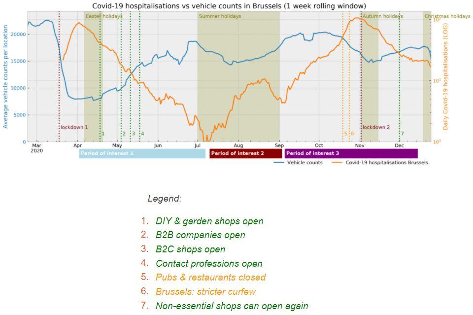
It is interesting to observe that a certain threshold in vehicle counts (around 16,000-17,000) had to be exceeded, in order to provoke the reversal of increasing/decreasing trends in COVID19 hospitalisations. The figure above shows clearly that during the first lockdown in 2020 traffic load decreased to nearly a third of its normal volume. A similar sudden drop in COVID-19 hospitalisations can be observed some weeks later in the beginning of April (mind the log scale). Remarkably, the COVID-19 hospitalisation numbers kept dropping until the beginning of July despite of the clear gradual increase in vehicle counts. Subsequently, only at the end of June the vehicle counts clearly exceeded the threshold of 16,000 vehicles, finally resulting in a strong increase of COVID-19 hospitalisations in July.
Similarly, the temporary fall in COVID-19 hospitalisations in the beginning of September can be explained by the valley below 16,000 in vehicle counts in the middle of the summer holidays. During the second lockdown, traffic counts were as well only temporary diving below the threshold, followed by a stagnation around the threshold value. As a result, the COVID-19 hospitalisations dropped only for a short period and even stagnated in the second half of December. Note that this threshold might deviate over time, as it is depending on external factors such as availability of mouth masks and people following the restrictions less stringently.
Increase in hospitalisations in Flanders also preceded by more traffic
As an extension to the Brussels vehicle counts, we also consider vehicle counts from the Telraam dataset. Telraam is an open project where citizens can monitor traffic by attaching a small camera to the inside of a window, which counts vehicles passing by. Since any citizen can participate, a large(r) number of locations can be monitored. Apart from the different Belgian regions, the big difference with the Brussels vehicle counts data is that the Telraam data is typically originating from residential areas, with hotspots in Leuven, Antwerp and Ghent. The Brussels vehicle counts originate from busier and critical traffic locations (e.g., the small ring). A drawback of the Telraam project is that such low-cost hardware is not able to detect vehicles after sunset. So, to allow for a fair comparison over all seasons, we excluded all counts before 9:00 and after 17:00. Additionally, locations with too few data points inside the time interval of interest (March 2020 - December 2020) were filtered out. Finally, we identified 379 qualitative vehicle counting locations in Flanders.
Based on this Telraam data, the same figure as in the Brussels case was constructed below. Focusing solely on the vehicle counts, one can observe a very similar traffic evolution up to the start of the second lockdown in November. However, in contrast to the Brussels numbers, a much steeper drop of vehicle counts was introduced in the beginning of November, leading to even less traffic than during the first lockdown.
There can be different explanations for this phenomenon. Maybe Flanders is simply a better student than Brussels when it comes to following the COVID-19 restrictions and recommendations. Most probably, the difference could be attributed to the more residential character of the locations and the exclusion of the peak hours from the Telraam dataset. After all, this sudden drop does not seem to precede a very dramatic decrease in COVID-19 hospitalisations compared to the Brussels case. In general, one can observe again a very similar (lagging behind) behaviour of the vehicle counts and the COVID-19 hospitalisations.

How much time needed to see the effect of a traffic reduction?
For both Brussels and Flanders, a delayed effect of the vehicle counts on the COVID-19 hospitalisations is observed. Although the window of delay between traffic and hospitalisation peaks seems very variable in the different periods, there is no doubt that there is some correlation between the vehicle counts evolution and the COVID-19 numbers.
In order to formally support this statement, we calculated the Pearson correlation between the COVID-19 hospitalisations and the average vehicle counts for three so called 'periods of interest'. Each period of interest represents a different stage (in terms of peaks) in the COVID-19 hospitalisations and is annotated in the two images above. Since we are interested in discovering which time offset leads to the highest correlation for each period of interest, the Pearson correlation was calculated for a time offset between 7 and 60 days for each period.
- The most optimal Pearson correlation during the first period of interest (the blue bar below the two plots) was obtained for both regions for a delay of 40-42 days. This indicates that the reduction in traffic (i.e., in people’s movement) needed 40-42 days before it took effect on the COVID-19 hospitalisations.
- For period of interest 2 (small peak during summer break), the offset with the highest Pearson correlation was too high to be reliable. We suppose that too many different factors impacted the hospitalisation rate in the summer period, which obviously cannot be captured solely by traffic counts.
- In period of interest 3 (the second major peak), the optimal Pearson correlation is obtained at a different offset in time for Brussels (36 days) and Flanders (22 days). Such a big difference in delay of effect can be attributed to the different nature of traffic data e.g., more business related in Brussels vs. residential in Flanders, more concentrated location counts in Brussels vs. fragmented ones in Flanders, etc. which are differently affected by COVID-19 measures.
So, is Steven Van Gucht's claim correct?
Based on this brief study, it is clear that an increasing trend in traffic volumes can serve as an early indicator for increasing numbers of COVID-19 infections, as claimed by Steven Van Gucht. However, the increase of COVID-19 infections is caused by a multitude of very diverse and dynamic factors, which are not captured in traffic data, e.g., unpredictable human behaviour and evolution of the virus (e.g., evolving time between symptoms and hospitalisation). Since it is very hard to take such effects into account, monitoring evolution in traffic volumes is not reliable for prediction, but still very useful to raise an alarm of caution.
This article was also published on the EluciDATA Lab website, as part of a series of blogs in the scope the MISTic project executed by the EluciDATA Lab of Sirris with Macq and VUB as partners. The MISTic project is subsidised by the Brussels-Capital Region - Innoviris.


]]>