In this third article in a series of blog posts in the context of the MISTic project concerning the traffic situation in Brussels in times of Covid-19 restrictions we zoom in on the traffic situation of the small ring of Brussels since the beginning of the restrictions until recently, guided by some elucidating visual analytics.
Our analysis is based on the open dataset of Brussels Mobility, which contains vehicle counts on 55 busy locations in the city of Brussels. In our first blog, we discovered that traffic had dramatically reduced overall, but less so on the small ring on Brussels, where peaks of up to 80% retained traffic were observed. In a second blog, we focused on the evolution of traffic during the first wave of relaxations of the restrictions, which revealed some interesting traffic volume patterns. In this third blog we are zooming in on the traffic situation of the small ring of Brussels since the beginning of the restrictions until now, guided by some elucidating visual analytics.
The small ring of Brussels is a sequence of many tunnels around the core center of Brussels, notoriously known for frequent traffic problems. Most of these tunnels are monitored by Brussels Mobility in terms of traffic flow per minute, average speed per minute and occupancy of the road (% of time the sensor is covered by a vehicle). We consider data for 16 of those locations from the beginning of the year until the present. Our aim is to identify and characterize traffic modes, i.e. distinct periods of time with similar traffic patterns, when considering all the 16 locations as one connected trajectory of tunnels. For this purpose, the dataset has been organized in such a way that the locations are sequentially ordered as they spatially appear in reality.
Divergent types of traffic
Our assumption is that during normal times the small ring goes through several different traffic modes which reoccur day after day. In order to identify those traffic modes, we have considered only the data before the lockdown (normal times) and were able to derive five distinct traffic modes by clustering along the time dimension.
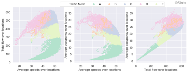
In order to understand the specific characteristics of each traffic mode in detail, we turn to visual analytics. In this case, we generate pairwise scatter plots of the flow, speed and road occupancy, averaged over all locations, and represent the clusters we obtain in different colours (see figure below). The scatter plots show well-formed curved patterns, which is the typical shape caused by traffic jams, i.e. high road occupancy results in lower vehicle speeds. The different traffic modes also appear well separated from each other with the exception of one, traffic mode B.
Traffic mode A represents little traffic and high speeds on average, while traffic mode D seems to represent highly saturated traffic, resulting in lower average speeds. Traffic mode C contains points in time where a lot of traffic is present, but still high average speeds are possible. Traffic mode E denotes in general fluent traffic resulting in higher average speeds. Finally as mentioned above, traffic mode B is the least distinctive, since it overlaps to some extent with traffic mode D. It seems to correspond to rather congested traffic at low average speeds.
We can exploit the above traffic modes further in many different ways:
They can be the basis for anomaly detection, e.g. we know at each moment in time what the expected traffic mode is, and so we can assume an anomaly occurs whenever a different traffic mode is observed at a specific time.
They can be the basis for traffic prediction, e.g. given a specific moment in time and a specific location, we can predict the amount of traffic and its average speed.
They can be used in subsequent visualizations to understand and interpret traffic evolution even better, as will be explained next.
An infinite carpet of traffic modes
We used the five traffic modes discussed above to construct a so-called label map by colouring the different time segments in a day with their respective traffic mode colours. If we do this for a sufficiently long time period as illustrated in the figure below, we obtain a colourful carpet, which offers a birds’ eye view of the composition of the different traffic modes over the time period under investigation. On the y-axis we represent the different days of the year, while the x-axis represents the time within each day. Each cell is coloured with the colour of the traffic mode that was observed at that specific day and time, which allows to describe each of the traffic modes in a more intuitive way:
Mode A: Night traffic (avg. occupancy 7%)
Mode B: Morning rush hour peak (avg. occupancy 26%)
Mode C: Day traffic outside rush hours (avg. occupancy 22%)
Mode D: Evening rush hour peak (avg. occupancy 28%)
Mode E: Early morning and late evening traffic (avg. occupancy 15%)
It is interesting to observe that our algorithm considered the morning and evening peaks as different modes, despite people might expect that the rush hours look the same. This is because the traffic flow is almost mirrored (people who went to their work in the morning usually take the reverse trajectory in the evening), plus there is on average a more recreational evening traffic. Note that the grey zones indicate missing data.
In the 'carpet of traffic modes' below, we can observe a clear repetitive pattern during the pre-Covid-19 period (indicated with 'normal'). The morning peaks, evening peaks, weekend patterns, etc. are repeating each day and each week.
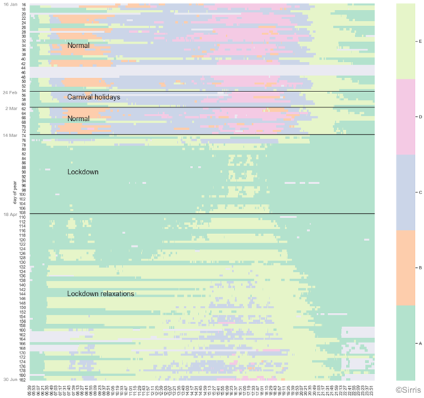
Lockdown traffic = normal night traffic
Our 'carpet of traffic modes' is offering a very concise, but still rather granular, visualization which is 'infinitely' expandable in time by rolling it forward over a certain period. It facilitates continuous monitoring of the traffic evolution in time e.g. detecting and interpreting recurring patterns during typical weeks (pre-Covid-19). It also allows for rapid detection of deviating behavior, i.e. which has not been observed in the past. We can easily capture the introduction of the first restrictions (14th of March, day 74) and the start of the lockdown (18th of March, day 78). Since then, mode A is predominantly present, which is typically the traffic mode corresponding to night traffic in normal conditions.
Rush hours are emerging
Another fascinating phenomenon which can be observed is the traffic mode evolution in time e.g. the gradual emergence of mode E already in the very beginning of the lockdown at around 7 p.m. and then slowly unrolling forward covering wider parts of the day. So, despite the expectation that there should be no difference in traffic intensities between the first four weeks of the lockdown, a small gradual increase can be observed. Subsequently, following on the gradual relaxation of the lockdown restrictions in May (days 122 until 152), we even observe almost constantly traffic mode E during the day. Eventually, mode C and even mode D (evening rush hour peak) are emerging during the typical rush hours, getting closer and closer to the normal situation, but not yet there.
No rush during rush hours
Zooming into in the ‘carpet of traffic modes’ for the most recent days, it appears that the traffic intensity of the small ring of Brussels during the typical rush hours is gradually increasing towards the volumes of the normal day traffic outside rush hours (mode C). Thus, although the traffic volume is steadily increasing, it has not yet been recovered completely to stagnating rush hour volumes.
This article was also published on the EluciDATA Lab website, as part of a series of blogs in the scope the MISTic project executed by the EluciDATA Lab of Sirris with Macq and VUB as partners. The MISTic project is subsidised by the Brussels-Capital Region - Innoviris.


]]>